User-friendly website navigation helps visitors understand where they are, where they can go next, and how to reach the information they need without friction. If you want to create user-friendly navigation in website design, the goal is not to make the menu look clever. The goal is to make the website easier to use, easier for search engines to understand, and easier for visitors to convert.
The simplest navigation test is this: can a first-time visitor find your most important pages without thinking too hard?
A strong menu should guide users to services, proof, pricing or process information, contact options, and supporting content without creating clutter or confusion.
What Is User-Friendly Website Navigation?
User-friendly website navigation is the structure of menus, links, labels, breadcrumbs, search features, and page paths that help visitors move through a website easily. It should make important pages obvious, reduce unnecessary clicks, and help users feel oriented throughout the experience.
Good navigation is not only a design detail. It is part of the website’s information architecture, SEO structure, and conversion path. A navigation system that is clear for users is usually easier for search engines to crawl and easier for teams to maintain.
Why Website Navigation Matters for UX, SEO, and Conversion
Website navigation affects three things at once: user experience, organic visibility, and conversion. Visitors use navigation to decide where to go next. Search engines use links and structure to understand page relationships. Businesses use navigation to move users toward service pages, lead forms, contact pages, and valuable content.
This is why navigation should be planned during website development, not added at the end. A clear menu supports discovery, while a confusing menu can bury important pages even if the website looks polished.
Navigation also connects directly to website conversion optimization. If visitors cannot find services, proof, contact options, or next steps, they are less likely to become leads.
Short Answer: How Do You Create User-Friendly Website Navigation?
To create user-friendly website navigation, keep the main menu simple, use descriptive labels, prioritize important pages, design for mobile first, add breadcrumbs where they help, include search for content-heavy sites, keep navigation consistent, use internal links strategically, and test the structure with real users or analytics data.
9 Website Navigation Best Practices
1. Keep the Main Menu Simple
The main menu should include only the pages users need most often. For many business websites, this means services, work or case studies, about, resources, and contact. Too many top-level items make the menu harder to scan and weaken the path to important pages.
2. Use Clear and Descriptive Labels
Menu labels should tell users what they will find after clicking. Labels like “Services,” “Work,” “Pricing,” “About,” and “Contact” are often stronger than vague labels like “Explore” or “Discover.” Clear labels support both usability and user-friendly website navigation.
3. Prioritize High-Value Pages
Your navigation should reflect business priorities. If a service page, lead-generation page, or case-study page is important, do not bury it. Strong navigation helps users reach pages that support decisions and revenue.
4. Design Mobile Navigation First
Mobile website navigation should be easy to open, read, tap, and close. Dropdowns, hamburger menus, sticky buttons, and nested categories should be tested on real screen sizes. Strong responsive web design ensures the navigation remains useful across devices.
5. Use Breadcrumbs Where They Help
Breadcrumbs are useful for websites with categories, nested pages, ecommerce sections, or large resource libraries. They help users understand their location and help search engines understand page hierarchy.
6. Add Search for Content-Heavy Websites
If the website has many articles, products, services, or resources, search functionality can reduce friction. Search is especially useful when users know what they want but do not know where it lives in the menu structure.
7. Keep Navigation Consistent
Users should not have to relearn the menu on each page. Keep navigation placement, labels, styling, and behavior consistent unless there is a clear reason to change them. Consistency builds confidence.
8. Use Internal Links Strategically
Navigation is only one layer of internal linking. Contextual links inside content help users move deeper into related pages and help search engines understand relationships. A strong internal linking strategy for business websites should support the main menu, not compete with it.
9. Test Navigation With Real Users
Analytics, heatmaps, click tracking, and simple user testing can reveal whether people actually use the menu as expected. If users miss important links or click non-clickable elements, the navigation needs refinement.
Navigation Types Compared
Different websites need different navigation patterns. The best choice depends on content volume, device behavior, page depth, and user expectations.
| Navigation Type | Best For | Strength | Watch Out For |
|---|---|---|---|
| Horizontal menu | Service websites and small business sites | Visible, familiar, easy to scan | Too many links can crowd the header |
| Dropdown or mega menu | Sites with many services or categories | Groups related pages clearly | Can become overwhelming if poorly grouped |
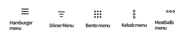
| Hamburger menu | Mobile layouts and compact interfaces | Saves space | Important links may become less visible |
| Sidebar menu | Dashboards, documentation, and large content hubs | Supports deeper structures | Can reduce content width |
| Footer menu | Secondary links, legal pages, support, and contact details | Useful backup navigation | Should not replace the primary menu |

Interactive Navigation Audit
Use these quick checks to diagnose whether your website navigation is helping or hurting users.
Users visit the site but do not reach service pages
Review the main menu labels, service grouping, homepage links, and internal links. Important commercial pages should be easy to find from the header, homepage, and related content.
Mobile users leave quickly
Check menu tap targets, menu depth, load speed, sticky header behavior, and whether contact or inquiry links are easy to reach. Mobile navigation should not require unnecessary hunting.
Users search instead of using the menu
This can mean the menu labels are unclear or the site structure does not match user expectations. Review internal search terms, analytics paths, and navigation click data.
Common Website Navigation Mistakes
The most common mistake is treating navigation as a place to list everything. Strong user-friendly website navigation is selective. It helps users choose the next relevant path instead of forcing them to decode the entire website structure.
Other mistakes include vague labels, too many dropdown levels, hidden contact links, inconsistent menus across pages, footer-only important links, and mobile menus that are difficult to tap or close. These issues can also affect how web design impacts SEO, because navigation and internal links influence how pages are discovered and understood.

User-Friendly Website Navigation Checklist
Use this checklist before publishing a new website or refreshing an existing menu.
- The main menu includes only the most important page groups.
- Menu labels are clear, descriptive, and familiar.
- Service pages are reachable within one or two clicks.
- Mobile navigation is easy to open, scan, tap, and close.
- Dropdowns are grouped logically and not overloaded.
- Breadcrumbs are used for nested pages where helpful.
- Footer links support secondary paths without replacing the main menu.
- Internal links guide users to related pages inside the content.
- Analytics or heatmap data is used to refine navigation decisions.
- Contact or inquiry actions are visible when users are ready to convert.
External Standard: What Google’s web.dev Says About Navigation
Google’s web.dev guidance on website navigation reinforces a simple principle: navigation should help users find what they need and understand where they are within the site. That is the same standard businesses should use when reviewing menus, breadcrumbs, search, and internal links.
Final Takeaway
User-friendly website navigation is not decoration. It is a functional system that helps users move through your site, helps search engines understand your pages, and helps your business guide visitors toward meaningful actions.
To create user-friendly navigation in website design, start with clear labels, simple structure, mobile usability, strategic internal links, and real behavior data. The best navigation feels almost invisible because users can find what they need without stopping to think.
Need a website structure that users can actually move through?
Erahaus builds website systems where navigation, content, UX, SEO, and conversion work together instead of fighting for attention.
Explore Website Development Website Conversion Optimization