
Packaging Design Trends Influencing Consumer Perception
A product is judged long before it is consumed or utilized. In premium retail and B2B hardware sectors, packaging is not merely a protective container; it is the physical manifestation of your corporate authority. When a buyer interacts with your packaging, they are subconsciously evaluating your operational competence, your attention to detail, and the justification for your premium pricing.
The Logic of Brand Perception in Physical Spaces
Brand perception logic dictates that the quality of the exterior directly communicates the quality of the interior. If an enterprise software company delivers a proprietary hardware node in a flimsy and unbranded cardboard box, the perceived value of that million dollar software contract immediately drops.
Packaging serves as the critical transition point between digital promise and physical reality. Every structural choice from the resistance of the lid to the texture of the internal casing sends a deliberate signal to the consumer. Modern market leaders do not treat packaging as an afterthought. They treat it as a highly engineered brand asset designed to secure customer loyalty at the exact moment of physical delivery.
Structural Minimalism and Aesthetic Purity
The era of loud and cluttered packaging is over. Premium brands now practice the philosophy of quiet confidence. When a package is covered in excessive marketing copy, vibrant bursts, and multiple competing fonts, it signals desperation. It screams for attention rather than commanding it.
Structural minimalism removes the unnecessary to reveal the core truth of the product. By utilizing negative space, precise typography, and a restrained color architecture, the packaging projects absolute certainty. This aesthetic purity must perfectly align with your core brand identity design to ensure a seamless transition from your digital storefront to the physical hands of the buyer.
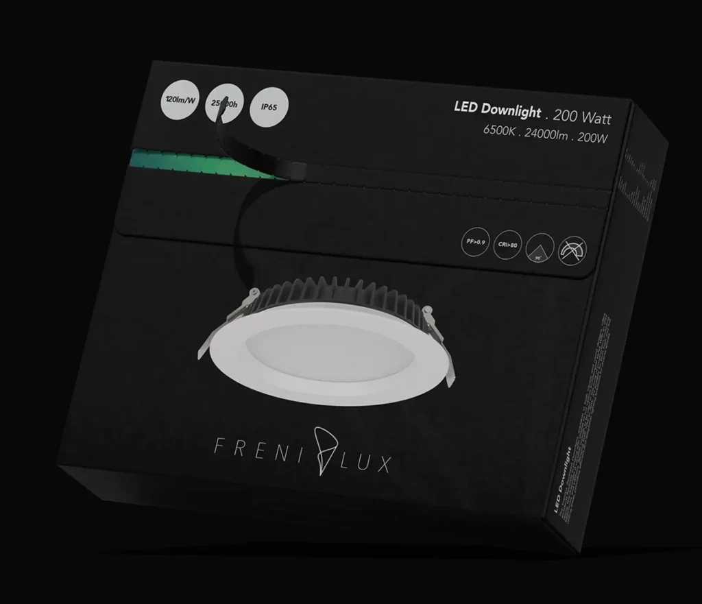
FreniLux®
FreniLux was developed as a contemporary lighting identity built around sophistication, clarity, and technical confidence. In a market often dominated by generic electrical packaging, the goal was to create a brand that feels elevated, premium, and instantly recognizable.
The visual direction balances minimal luxury aesthetics with practical product communication, allowing customers to quickly understand specifications while experiencing a stronger sense of quality and trust.
The packaging was designed to stand apart from conventional lighting boxes through a darker premium palette, clean technical hierarchy, and restrained branding. Matte black surfaces create a modern architectural feel, while selective accent colors help organize wattage, size, or product range distinctions.
Information is structured to support fast retail scanning and contractor usability, including lumen output, wattage, color temperature, IP rating, and installation category. This makes the packaging attractive to both homeowners and professional buyers.
Visual design only accounts for half of the packaging experience. The tactile experience how the package actually feels in the hands is a massive driver of consumer perception. Weight, texture, and structural resistance are psychological triggers that communicate luxury and durability.
Consider the unboxing friction. A premium package should not open instantly; it should offer a calculated amount of structural resistance, forcing the user to slow down and appreciate the reveal. Achieving this level of physical precision requires advanced product design engineering to ensure the materials, the structural folds, and the interior architecture perform flawlessly. High density foams, soft touch matte finishes, and debossed structural elements all contribute to a tactile environment that justifies premium market positioning.
The Tactile Experience and Material Engineering
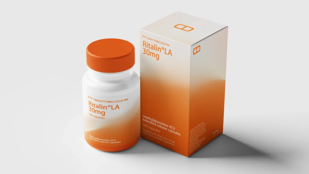
Pharmacore®
Pharmacore is a conceptual pharmaceutical brand created to explore how strategic design can reshape perception within the healthcare sector. The project focuses on building a modern medical identity through clarity, trust, and visual consistency. By combining clean aesthetics with functional communication principles, Pharmacore demonstrates how branding can elevate pharmaceutical products beyond standard industry expectations.
The packaging was developed as a balance between clinical professionalism and contemporary brand presence. A minimal structural layout was used to reduce visual noise and improve information clarity, while the bold orange gradient introduces recognition, energy, and strong shelf distinction. Typography was carefully organized to support dosage visibility, product hierarchy, and quick readability in real-world retail or medical environments.
Across bottle and box formats, the system remains consistent, scalable, and instantly identifiable. Every element was considered to create a pharmaceutical package that feels trustworthy, premium, and relevant to a modern healthcare audience rather than outdated or overly sterile.
Sustainable Architecture as a Trust Signal
Sustainability is no longer a marketing buzzword; it is a structural expectation. However, premium brands approach sustainability differently than mass market competitors. Instead of using cheap recycled materials that degrade the tactile experience, market leaders engineer eco friendly packaging that maintains absolute structural integrity.
This involves utilizing molded pulp composites, biodegradable precision plastics, and monolithic material designs that make recycling effortless for the end user. When a corporate brand invests in premium sustainable architecture, it signals long term market vision and operational maturity, further reinforcing deep consumer trust.
| Packaging Element | Common Generic Mistake | Erahaus Structural Strategy |
|---|---|---|
| Exterior Graphics | Cluttering the box with excessive feature lists and vibrant colors. | Applying minimalist luxury with focus on negative space and clean typography. |
| Tactile Weight | Using lightweight and thin cardboard to reduce basic shipping costs. | Engineering dense materials that add physical weight to signal premium quality. |
| Unboxing Flow | Creating a chaotic opening experience with messy tape and loose inserts. | Designing a staged reveal with calculated friction and precision cut interior staging. |
| Sustainability | Using mixed materials that are impossible for the consumer to easily recycle. | Utilizing monolithic material architecture to ensure effortless and elegant sustainability. |
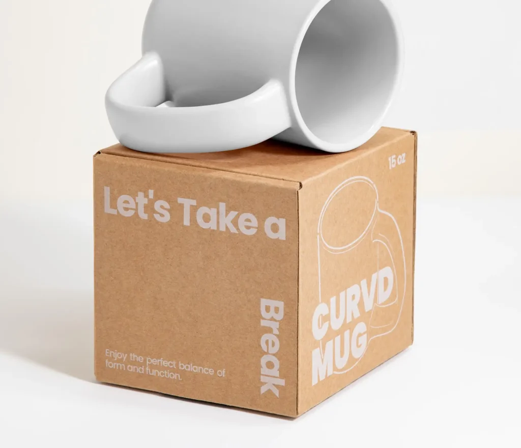
Curvd®
CURVD was created as a modern drinkware concept centered around comfort, form, and everyday ritual. The brand explores how a simple object like a mug can be redesigned through ergonomics, emotional connection, and contemporary aesthetics.
Built around a distinctive curved handle system, CURVD transforms the traditional mug into a more comfortable and memorable experience. The identity balances functional innovation with a clean visual language that feels modern, warm, and lifestyle driven.
The packaging was designed to reflect the same simplicity and personality found in the product itself. Using natural kraft materials, bold typography, and minimal graphics, the system creates an honest and modern presentation that feels both premium and approachable.
The structural design supports gifting, retail display, and e-commerce delivery, while the clean visual hierarchy helps communicate product size, purpose, and brand character instantly. Every detail was considered to turn unboxing into part of the CURVD experience.
Establish Physical Market Authority
Your packaging is a permanent physical touchpoint between your brand and your highest value clients. We engineer structural packaging solutions that eliminate doubt, elevate consumer perception, and solidify your position as the definitive market leader.
FAQs
How does packaging design influence consumer perception?
Packaging is the first physical interaction a buyer has with your brand. The weight, texture, and visual minimalism subconsciously signal the quality of the product inside. Premium packaging creates immediate trust and validates a high price point before the product is even used.
What is the role of tactile experience in packaging?
Tactile experience refers to how a package feels. Using soft touch finishes, debossed logos, and dense structural materials triggers a psychological response associated with durability and luxury. It transforms a standard delivery into a memorable brand event.
Why is structural minimalism trending in premium markets?
Minimalism communicates quiet confidence. Brands that use clean lines and negative space signal that their product is so superior it does not need loud marketing copy to sell itself. This aesthetic purity is highly trusted by corporate buyers and luxury consumers.
Can sustainable packaging still feel like a premium brand?
Absolutely. The key is advanced material engineering. Instead of using cheap and flimsy recycled paper, market leaders use high density molded pulp and precision engineered biodegradable structures that feel incredibly solid while maintaining strict eco friendly standards.