Graphic design in 2026 is moving away from sterile perfection and moving back toward visible craft, expressive form, and dimensional storytelling. After years of ultra minimal interfaces and overly polished brand systems, creative direction is returning to texture, contrast, depth, and flexibility.
Audiences are more visually aware than ever. They recognize templates quickly and ignore generic visuals even faster. Brands now compete across fast scrolling feeds, crowded packaging shelves, high speed interfaces, and multi platform campaigns, especially across evolving social media trends in the UAE and similar high velocity markets. Recognition and emotional connection must happen almost instantly.
As a result, designers and brand teams are prioritizing human signals, bold typography, layered visuals, and adaptable identity systems. These are not random style shifts. They are strategic responses to how people now see, scan, and remember visual content, and they are most effective when guided by a structured branding process for companies.
Below are the core graphic design trends in 2026 that are shaping branding, digital design, and creative campaigns.
1. Nostalgic and Retro Futuristic Aesthetics
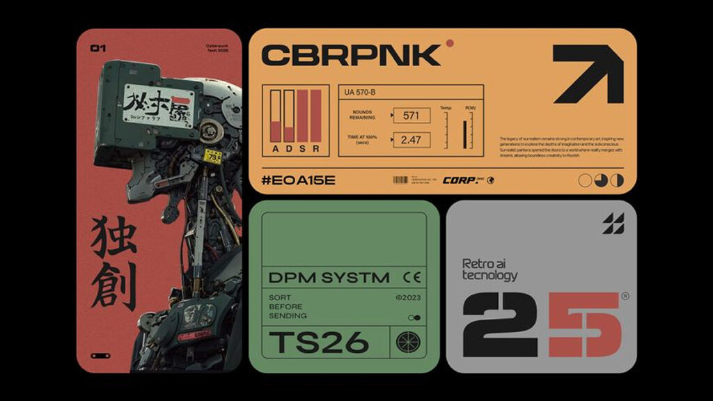
One major graphic design trend in 2026 is the blend of nostalgic and retro futuristic aesthetics. Designers are combining visual cues from past eras with modern execution to create work that feels both familiar and forward looking.
This includes vintage color palettes, classic poster style compositions, analog textures, early digital motifs, and revived 1930s typefaces combined with modern typography, motion, and rendering quality.
Nostalgia creates emotional familiarity and trust. Futuristic execution keeps the work from feeling dated. Together they produce a layered visual language that connects memory with innovation.
Brands use this approach to build emotional resonance while still signaling progress and relevance, especially when supported by strong brand storytelling in digital marketing.
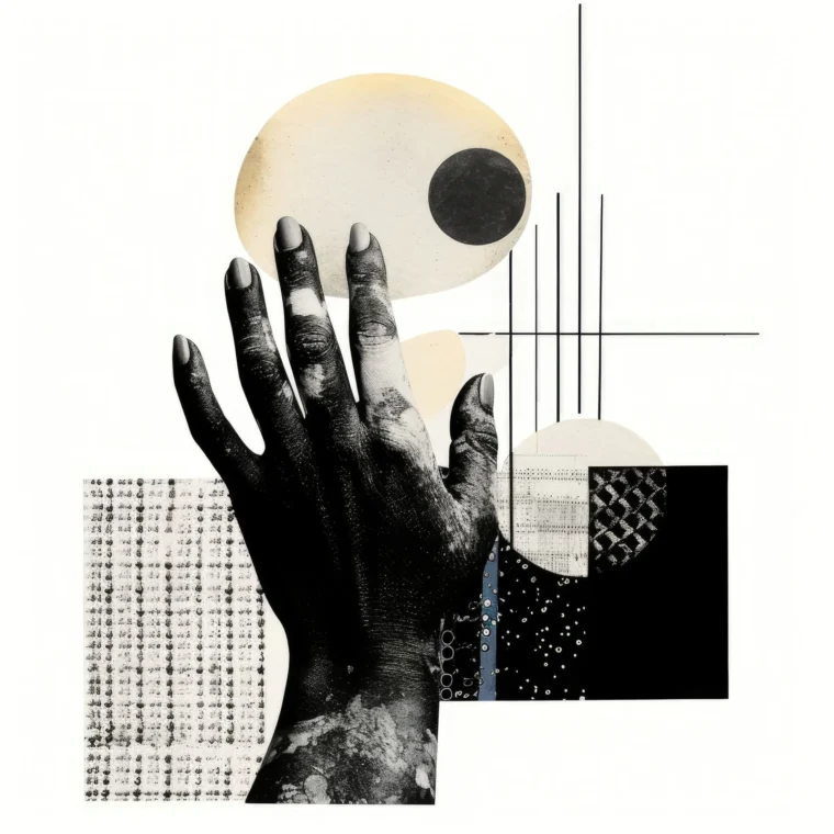
2. Organic Imperfection with Texture, Personality, and Wonkiness
Organic imperfection is becoming a defining direction in 2026 visual design. Instead of removing irregularities, designers are adding controlled imperfection to communicate personality and human authorship.
This includes texture, grain, rough edges, uneven shapes, loose alignments, and tactile visual surfaces. These elements signal that a real designer made intentional choices rather than relying on automated layout defaults.
Organic imperfection adds warmth and character. It helps brands feel more human and less mechanical.
There is an important discipline behind this trend. Every imperfect element should connect back to the project brief and the target audience. Texture and wonkiness must support the message, not distract from it.
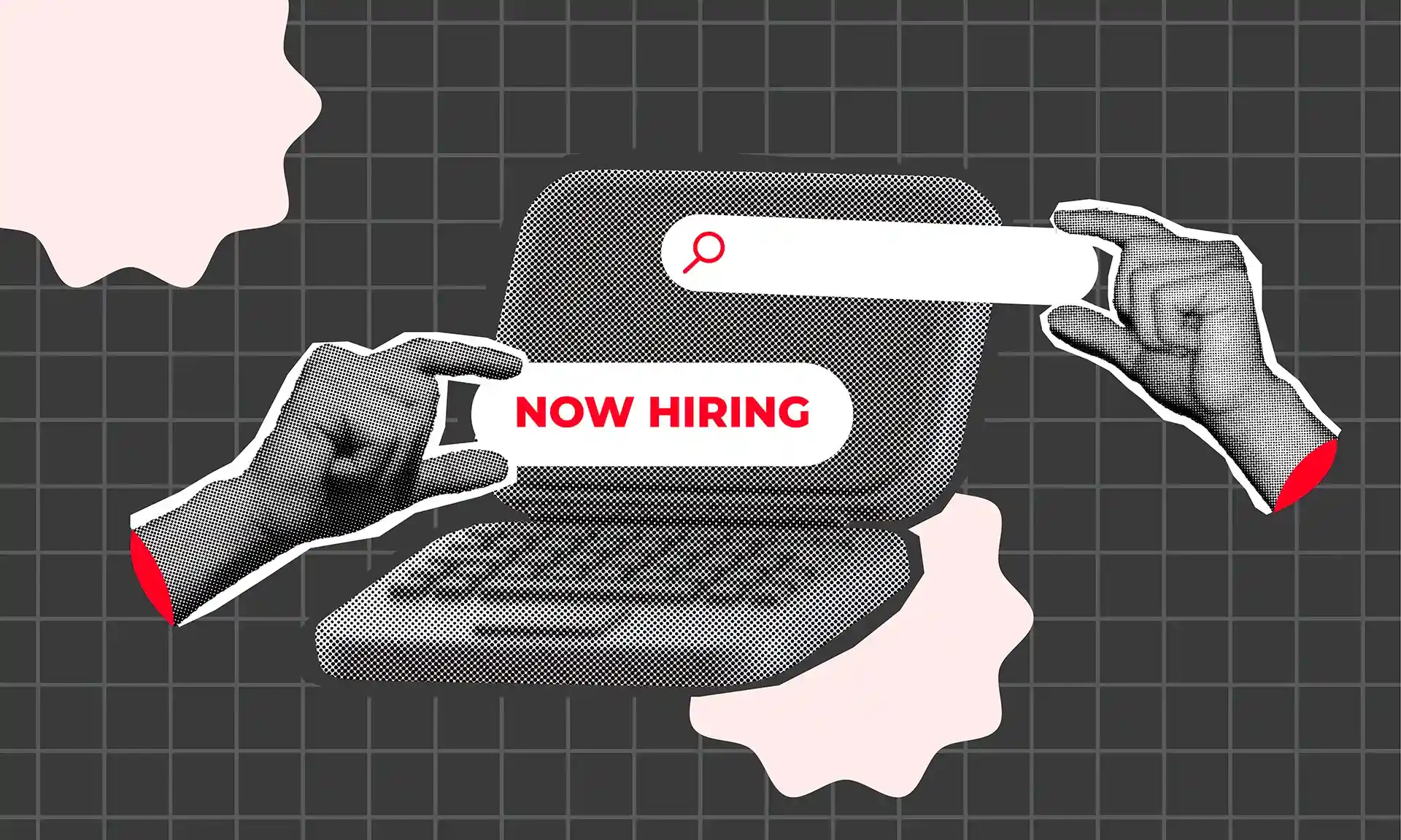
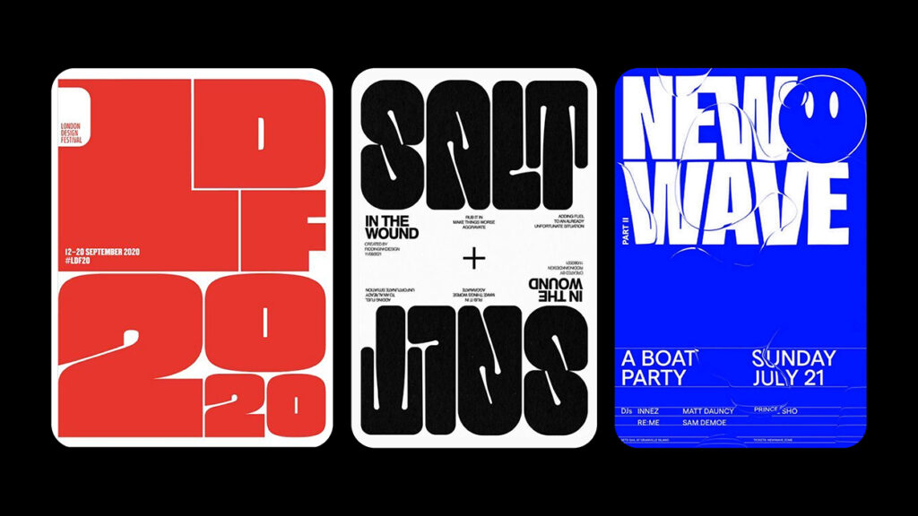
3. Hyper Bold Typography and High Contrast Layouts
Hyper bold typography and high contrast layouts are central tools in 2026 graphic communication. Large, heavy type and strong color contrast are widely used in hero sections, social ads, billboards, packaging, and fast UI moments.
Typography is often treated as the primary visual anchor rather than a supporting layer. Oversized letterforms and short, direct messages increase speed of recognition.
High contrast improves readability across devices and lighting conditions. It also supports accessibility and scanning behavior.
This trend works best when boldness is supported by hierarchy and spacing. Strong typography needs structure to remain clear and persuasive.
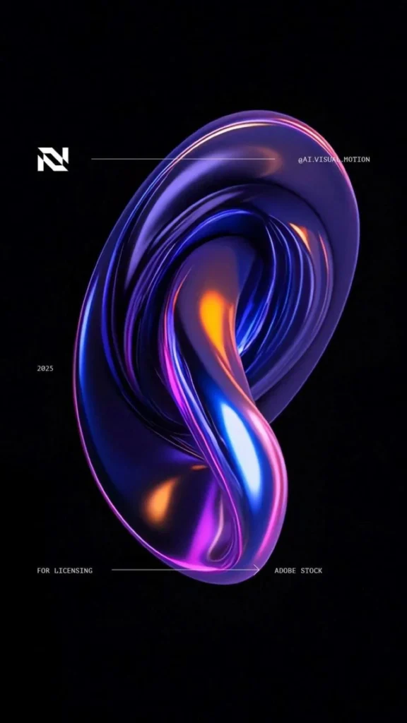
4. Multi Dimensional Visuals with 3D, Motion, and Depth
Multi dimensional visuals that use 3D, motion, and depth are expanding across branding and digital experiences in 2026. Flat design is increasingly enhanced or replaced by spatial and layered visual systems.
Three dimensional objects, depth lighting, layered scenes, and animated transitions create immersion and visual richness. Motion is used not only for decoration but also to guide attention and explain features.
These techniques increase perceived value and engagement. Products appear more tangible. Interfaces feel more responsive. Campaign visuals feel more cinematic.
Many modern executions combine 3D elements with photography and graphic overlays to produce hybrid visuals that balance realism and control.
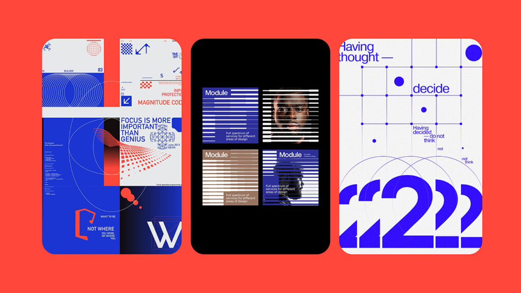
5. Modular and Flexible Branding Systems
Brand identities are becoming more modular and flexible instead of fixed and rigid. Modern brands operate across many platforms and formats. Static identity systems cannot scale efficiently across that range.
A modular branding system uses adaptable components such as responsive logo versions, flexible grids, rearrangeable layout blocks, and expandable color systems. The brand remains recognizable while compositions adapt.
This flexibility allows faster content production and easier campaign variation while maintaining consistency. It also supports localization and channel specific design needs.
Modular systems function like structured toolkits rather than single locked templates.
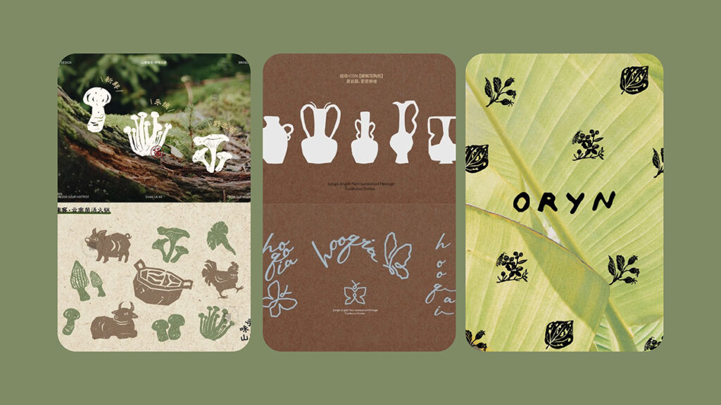
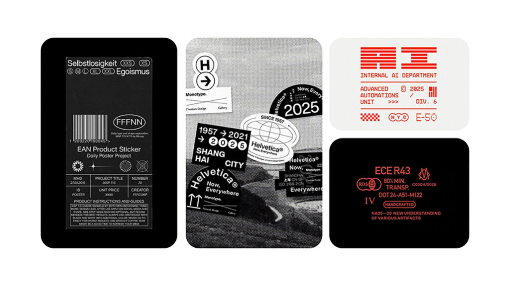
6. Micro Graphics
Micro graphics are small visual elements that add detail, rhythm, and informational clarity to layouts. Examples include icons, mini indicators, markers, tags, and small diagram components.
Instead of large empty areas, designers are adding controlled micro detail to increase perceived sophistication and guide user scanning.
Micro graphics help structure information and improve navigation across dashboards, product pages, packaging, and editorial layouts.
The key principle is restraint. Micro graphics should enhance clarity, not create clutter.
Why These Graphic Design Trends in 2026 Are Effective
These design trends work because they align with real audience behavior. People scroll faster, compare more options, and respond more strongly to visuals that feel intentional and distinctive.
Human signals increase trust. Bold contrast increases recognition speed. Depth and motion increase engagement. Modular systems increase scalability.
The most successful brands will not apply every trend. They will select and adapt the ones that best support their strategy and audience.
Wrap Up
Graphic design in 2026 is moving toward visible intention and away from default perfection. As Satori is pointing out in (Graphic Design Trends 2026) video, Texture, bold typography, dimensional visuals, and flexible systems all signal deliberate creative choice.
Polish alone is no longer enough. Distinctiveness and clarity matter more. The most effective design will feel crafted, not generated, structured, not accidental.
At Erahaus, these trends are not treated as surface level style decisions. They are applied as strategic tools. Every texture, type choice, layout system, and visual layer is mapped back to the brief, the business objective, and the target audience. Design is crafted to feel human, bold, and intentional while remaining structured, scalable, and commercially effective.
That is where memorability lives. And thankfully, memorability still converts better than safe design ever did.
FAQ
How can designers use organic imperfection without looking unprofessional?
By keeping imperfection intentional and controlled. Texture and irregularity should support the concept and message. Alignment with the brief and audience keeps the result professional.
Why is bold typography so dominant in 2026 design?
Because attention windows are short and competition is intense. Bold typography communicates faster than complex visuals and performs better in fast scrolling and crowded environments.
Do all brands need 3D and motion design now?
Not all brands need heavy dimensional design, but many benefit from some level of depth or motion. It is especially useful in product storytelling and digital experiences.
Let's build something that actually works.
Erahaus helps businesses grow through sharper branding, better systems, and marketing that drives real results. No fluff. No retainers that go nowhere.