
Brand Identity Design Services Built on Strategic Minimalism
In the modern corporate landscape, visual clutter is the enemy of trust. Erahaus provides premium brand identity design services tailored for established enterprises and market leaders. We do not chase fleeting aesthetic trends or rely on decorative filler. We build structural visual systems rooted in quiet confidence and minimalist luxury. By treating your corporate identity as an engineered asset, we ensure your brand commands immediate respect and dictates the standard within your industry.
The Architecture of Market Authority
A logo is merely a signature; a brand identity is the complete structural framework that dictates how your company is perceived by the market. When procurement teams and executive decision makers interact with your brand, they are subconsciously evaluating your operational competence based on your visual presentation.
If your identity is fragmented, overly complex, or outdated, it introduces massive cognitive friction into the buying process. Buyers equate visual chaos with operational chaos. Conversely, an identity built on minimalist purity signals absolute certainty. It demonstrates that your business is so structurally sound and confident in its value that it does not need loud marketing graphics to secure a contract. This aesthetic discipline justifies premium pricing and shortens the sales cycle.
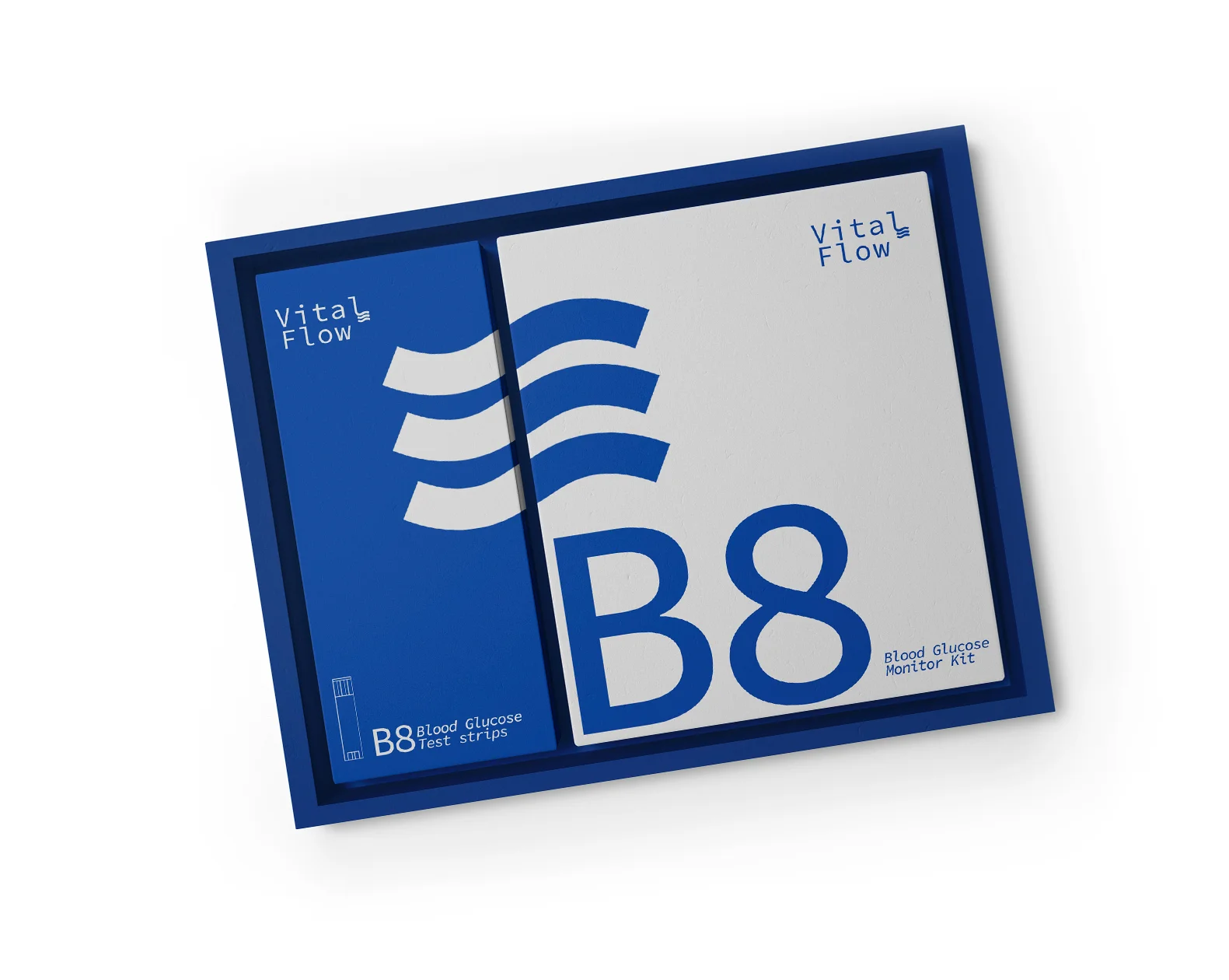
Magna KW was developed as a modern workplace brand built around functionality, movement, and long term value. In a market often shaped by generic corporate visuals, the goal was to create an identity that feels progressive, dependable, and instantly recognizable.
The brand direction balances clean aesthetics with practical communication, allowing Magna KW to present its products and services with greater clarity, confidence, and market presence.
A bold green accent paired with a monochrome foundation was selected to express growth, energy, and modern thinking. Strong typography and structured layouts create a visual language that remains sharp across digital, print, and environmental applications.
Every element was designed to keep the brand consistent, memorable, and adaptable as Magna KW continues to expand across sectors and markets.
The identity was extended across website design, stationery, uniforms, exhibitions, signage, packaging, and social media. This created a connected brand experience where every touchpoint reinforces professionalism, trust, and long term recognition.
Because apparently consistency is still a rare luxury in business. Magna KW now looks like one company instead of seven departments arguing separately.
Phase 1: Strategic Discovery and Alignment
Working as your dedicated branding agency in Dubai, we define the precise market perception your new identity must achieve. This phase locks in your brand archetype, target demographic, and core positioning.
Phase 2: Structural Concept Engineering
We develop the primary visual marks in pure black and white to ensure absolute structural integrity. We focus on scale, legibility, and geometric precision before any color psychology is introduced.
Phase 3: Comprehensive System Design
Once the primary structure is approved, we build the complete ecosystem. This includes corporate color architecture, strict typographic hierarchies, and custom iconography designed to perform perfectly across both physical and digital mediums.
Phase 4: Digital Translation and Web Integration
A premium brand identity must scale flawlessly into interactive environments. We ensure your new visual system is translated perfectly into your digital storefront through our custom website development services, eliminating user friction and maximizing digital conversion rates.
Phase 5: Governance and Asset Deployment
We finalize the project by delivering a comprehensive operational rulebook. Your brand guidelines dictate exact spatial clearances, color codes, and usage rules to protect your visual equity as your company scales.
Build Your Brand Identity System
The Visual Engineering Process
True market dominance requires a rigorous and disciplined design methodology. We execute our brand identity projects through a highly controlled sequence to ensure flawless application.
A successful visual identity cannot exist in a vacuum. It must be a direct translation of an underlying business logic. Before we draw a single line or select a typographic hierarchy, we ensure your visual architecture is fully aligned with your strategic market positioning.
This deep alignment is why our design execution is intimately connected to our overarching branding process. We audit your competitive landscape and define your operational moat first. Only then do our designers engineer the exact color systems, structural marks, and digital assets required to communicate that specific strategic advantage.
Bridging Visual Execution with Core Strategy

Al Sabah General Electric partnered with Erahaus to modernize a respected legacy brand through a complete identity refresh, stronger digital presence, and a future ready market position. The objective was to preserve decades of trust while presenting the company with greater clarity, confidence, and contemporary relevance.
From visual restructuring to campaign execution and e-commerce development, every decision was made to strengthen perception, improve usability, and elevate Al Sabah’s standing in a rapidly evolving market.
The rebrand introduced a sharper identity system built around authority, reliability, and progress. A refined logo, structured typography, and a confident deep blue palette were developed to communicate trust, technical expertise, and long term stability.
This new direction allowed Al Sabah to maintain its heritage while appearing more modern, adaptable, and aligned with the expectations of today’s commercial audience. Rare moment when evolution happens without destroying history.
The identity was rolled out across stationery, brand guidelines, marketing campaigns, showroom materials, and a modern e-commerce platform designed to showcase products with clarity and confidence.
The result was a connected brand experience that improved recognition, strengthened customer trust, and positioned Al Sabah as a legacy company ready for the next generation of growth.
Brand Identity Deliverables Matrix
Executives require clear visibility into operational outputs. Below is the exact framework of structural deliverables you receive when partnering with Erahaus for visual identity engineering.
| Design Element | Strategic Purpose | Corporate Output |
|---|---|---|
| Primary Brand Marks | Establishes the core visual signature and structural foundation of the company. | Master vector files, secondary lockups, and digital scale icons. |
| Color Architecture | Dictates the psychological tone and ensures absolute consistency across platforms. | Exact HEX, RGB, CMYK, and Pantone reproduction codes. |
| Typographic Hierarchy | Eliminates reading friction and projects authoritative corporate communication. | Primary and secondary font licenses, web typography rules. |
| Brand Governance | Prevents visual fragmentation and protects brand equity as your business scales. | Comprehensive Brand Guidelines operational manual. |
Architect Your Corporate Legacy
Stop allowing outdated or generic visual systems to erode your market authority. We engineer structural identities for brands that refuse to be ignored, transforming your visual presence into a high performance business asset.
Or fill the form below, and we’ll come back to you shortly:
FAQs
What is the difference between a logo design and a brand identity?
A logo is a single graphic mark. A brand identity is the comprehensive visual and operational system that supports that mark. It includes your strict color codes, typographic rules, photographic direction, and digital UI application. A logo alone cannot carry the weight of a corporate brand.
How long does a brand identity project take?
A premium visual identity engineered for a corporate enterprise typically requires 4 to 6 weeks. If the project includes deep strategic positioning discovery and full custom web development translation, the timeline extends to 10 to 12 weeks to ensure flawless structural execution.
Will a rebrand confuse our existing clients?
Not if executed strategically. We frame the new visual identity as an operational evolution, not an erasure of your history. By utilizing a calculated rollout roadmap, we ensure your transition signals stability and premium growth to your current client base.
Do you provide brand guidelines with the final design?
Absolutely. We view brand guidelines as a strict operational rulebook. Every identity we engineer includes a comprehensive governance document detailing exact spatial clearances, typography sizing, and examples of incorrect usage to protect your visual equity.