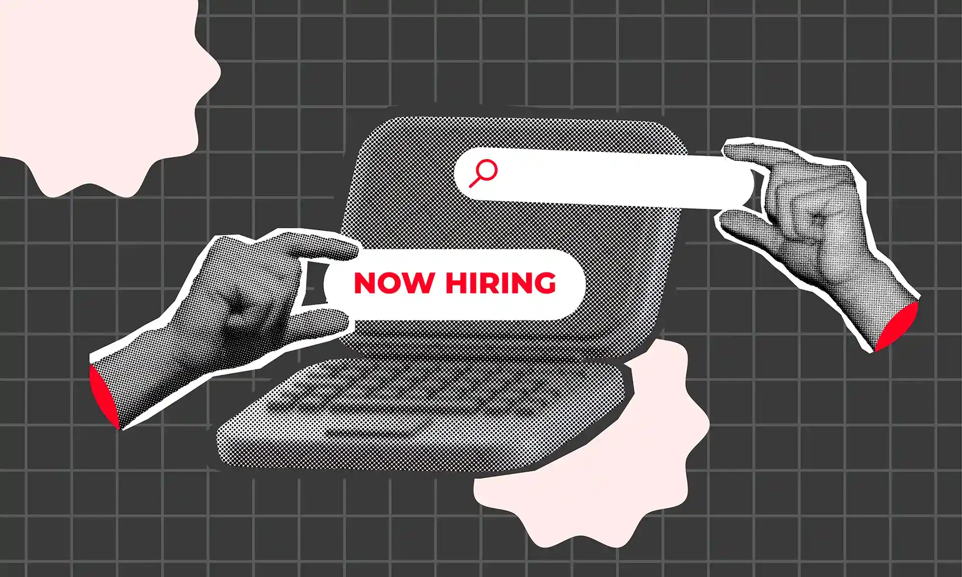
Have you ever visited a website that looked stunning but was difficult to navigate? How Can Graphic Design Improve Website User Experience goes far beyond aesthetics—it’s about creating an experience that feels intuitive, engaging, and seamless. In today’s digital-first world, your website design can make or break your brand. Effective graphic design plays a crucial role in enhancing User Experience (UX), helping you leverage visual elements to improve user satisfaction, engagement, and conversions.
Why Having a Good Website is Important
A well-designed website is essential as it often serves as users’ first interaction with your brand, building trust and credibility from the start. A professional and organized layout signals reliability, while an intuitive structure enhances user experience, guiding visitors seamlessly and boosting conversions. It also improves SEO, expanding your reach to new audiences. With over half of online traffic coming from mobile, responsive design is crucial for maintaining high search rankings and user satisfaction.
Altogether, a well-designed website strengthens brand perception, visibility, and long-term growth.

What is UI/UX?
User Interface (UI) refers to the visual components users interact with on a website. This includes buttons, typography, icons, and page layouts. A good UI focuses on both visual appeal and ease of use.
User Experience (UX) goes beyond the visual—it’s about the overall feel of the website. A good UX design ensures that users can navigate your website effortlessly, find what they’re looking for, and leave satisfied.
In short, while UI deals with how things look, UX is concerned with how things work.
More Explanation of UX
UX is the user’s journey across your website. It involves:
User Research
Understanding your audience’s needs, goals, and pain points through surveys, interviews, and behavioral analysis.
Wireframing and Prototyping
Sketching and modeling the user journey to identify key interaction points before designing visually.
Accessibility
Ensuring your website is usable by individuals with disabilities, whether that means using proper color contrast or ensuring keyboard navigation is possible.
Expanding the Role of Graphic Design in UX
Graphic design is essential not just for visual appeal but for enhancing usability and guiding user flow. Visual communication through icons, color cues, and infographics simplifies complex information, making it easier for users to absorb content. Aesthetic consistency—ensuring uniform colors, fonts, and button styles—builds brand recognition and keeps the user experience seamless, preventing confusion.
Effective design also guides users by using visual hierarchy to direct them toward key sections, such as bold headings and prominent buttons that naturally lead users through the site. High-quality design also builds trust; a visually polished site conveys professionalism, encouraging users to engage with a site they find easy to navigate and visually trustworthy.
How Graphic Design Transforms User Experience
Graphic design is essential for improving website UX by guiding users, building trust, and enhancing engagement. Here are some effective design insights to help unlock UX potential:
Visual Hierarchy & Navigation
A clear visual hierarchy is essential in guiding users through a website and creating an intuitive experience. By strategically using contrast, size, and positioning of elements like headings, buttons, and images, designers can draw attention to key areas. Larger text or bold colors can emphasize important elements, like CTAs, helping users naturally find their way.
Effective visual hierarchy not only makes navigation easier but also enhances content consumption by focusing user attention on the most relevant information first.
Case Study: Apple’s Visual Hierarchy Mastery in Web Design
Apple’s website leverages visual hierarchy to deliver an intuitive, premium browsing experience. Full-width banners and organized product grids showcase new releases, while strategic white space and contrasting call-to-action buttons guide users seamlessly. Large headings highlight key information, making the site visually compelling and easy to navigate. This approach effectively directs attention, reduces cognitive load, and reinforces Apple’s high-end brand image.

Consistency & Branding
Consistency in design is crucial for creating a cohesive brand experience across a website. Using uniform colors, fonts, logos, and other design elements builds user trust by providing a familiar environment, reducing confusion, and reinforcing the brand identity. For example, maintaining the same color on every CTA button or keeping a uniform font style across headings creates a sense of harmony.
Establishing a brand style guide helps designers and developers maintain this consistency, ensuring a unified look and feel that resonates across all web pages.
Microcopy for Guidance
Microcopy refers to the tiny bits of text that guide users through their journey, such as button labels, error messages, and tooltips. Thoughtful, concise microcopy can reduce user frustration by providing context and guidance at critical points. For instance, instead of generic error messages (“Error: invalid input”), more specific microcopy (“Oops! Password must be at least 8 characters”) helps users understand exactly what went wrong and how to fix it.
By integrating microcopy thoughtfully, graphic design not only enhances usability but also creates a friendlier, more intuitive experience.
Loading Animations and Progress Indicators
Waiting can be frustrating, especially on the web. Loading animations or progress bars keep users engaged during loading times and reassure them that the page is working as intended. These elements are especially useful on interactive or resource-heavy pages. Rather than a static loading icon, incorporating an interactive or visually appealing animation can make waiting feel less tedious and more like part of the brand experience.
A simple progress bar that shows how much time is left or an animation that reflects brand personality can improve patience and retention.

Negative Space (White Space) for Focus
While many designers focus on what elements to add, often the use of negative space—or white space—is overlooked. Strategic use of negative space improves readability, reduces cognitive load, and draws focus to important elements like CTAs. By giving key components “breathing room,” white space helps avoid visual clutter and allows users to process information more easily.
Effective use of white space subtly guides users’ attention, making the website feel less overwhelming and more organized, thus improving the overall user experience.
Color Contrast for Enhanced Readability
Many designers prioritize brand colors without considering that high contrast between text and background is crucial for readability, particularly for users with visual impairments. For instance, light gray text on a white background might align with brand aesthetics but can be difficult for some users to read. Balancing brand identity with accessible color contrast ensures readability for a wider audience.
Using accessible contrast ratios (like dark text on a light background) can enhance UX without compromising brand design.
Case Study: Spotify’s Effective Use of Color Contrast
Spotify’s interface showcases how to balance brand identity with accessibility through color contrast. Using a dark background paired with white or light-colored text, Spotify ensures high readability, especially on its dark-themed app. This high contrast aligns with Spotify’s brand while also accommodating users with visual impairments. By maintaining accessible contrast ratios, Spotify achieves both a cohesive design and enhanced user experience, demonstrating how color contrast can be a powerful tool for both usability and aesthetic consistency.

Iconography for Quick Understanding
Icons provide quick, visual shorthand for frequently used actions, like search, menu, or profile. Effective icons make navigation smoother by visually representing actions without relying on text, saving space and simplifying the layout. However, it’s important to use universally recognized icons to avoid confusion; users should not have to guess what an icon means.
Incorporating icons thoughtfully improves navigation and reduces cognitive load, allowing users to find what they need more easily.
Studies show that adding iconography can increase website engagement significantly:
Scroll-Triggered Animations for Visual Engagement
Animations that trigger as users scroll through a page add visual interest and guide users naturally through the content. For instance, a graphic element that fades in or a section that slides into view as the user scrolls keeps them engaged and creates a sense of progress. These scroll-triggered animations should be subtle and purposeful, avoiding excessive motion that might distract from the content.
Scroll-triggered animations make the website feel interactive and responsive, enhancing user engagement.

Button Shape and Size for Clickability
The shape, size, and padding of buttons can significantly impact user experience. Rounded buttons tend to feel more inviting and approachable, while larger buttons with generous padding improve clickability, especially on mobile devices. Buttons that are too small or too close to other elements can frustrate users, especially on touchscreens.
By optimizing button shapes and sizes, designers make the site easier to navigate, especially for mobile and visually impaired users.
UX Potential with Design
In conclusion, graphic design plays a transformative role in enhancing website UX. By incorporating thoughtful design principles—such as visual hierarchy, consistency, accessible typography, and interactive elements—websites can become not only visually appealing but also intuitive and user-friendly. Effective graphic design helps to engage users, guide their journey, and create a seamless experience that builds trust and encourages return visits.
Embracing these strategies will allow you to unlock the full potential of your site, creating an experience that resonates with users and keeps them coming back.