Future
and
Vision of Magna KW
We believe that an investment in the quality of the space will pay more than building the room itself. A focus on quality interior design will create a more comfortable and inviting space that will be enjoyed for years to come. We help our clients in creating beautiful, stylish, and functional spaces that empower educational institutions and their communities. We are committed to continuously improving our products, services, and operations in order to make a positive impact on society.
Description
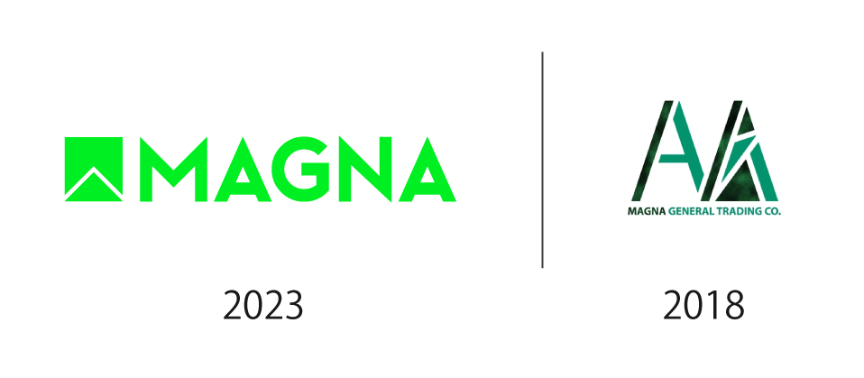
When we set out to redesign the Magna KW logo, we wanted to create a visual identity that was not only distinct and memorable, but that also embodied the values and mission of our brand. As a producer of educational furniture, our goal is to create products that support the learning process while also being functional, durable, and eco-friendly.
The new logo features a sleek and modern design that captures the essence of our brand in a simple, yet powerful way. The sharp edges in the logo design are a nod to the strength and reliability of our products, while the friendly, approachable feel of the logo represents our commitment to creating a welcoming and inspiring learning environment.
The green color palette of the logo was chosen carefully to reflect our brand's core values of sustainability, harmony, and growth. Green is a color that is often associated with nature, education, and renewal, all of which are fundamental to our mission of creating furniture solutions that enhance the learning experience while also promoting environmental responsibility.
Simple Modern Friendly

Colors
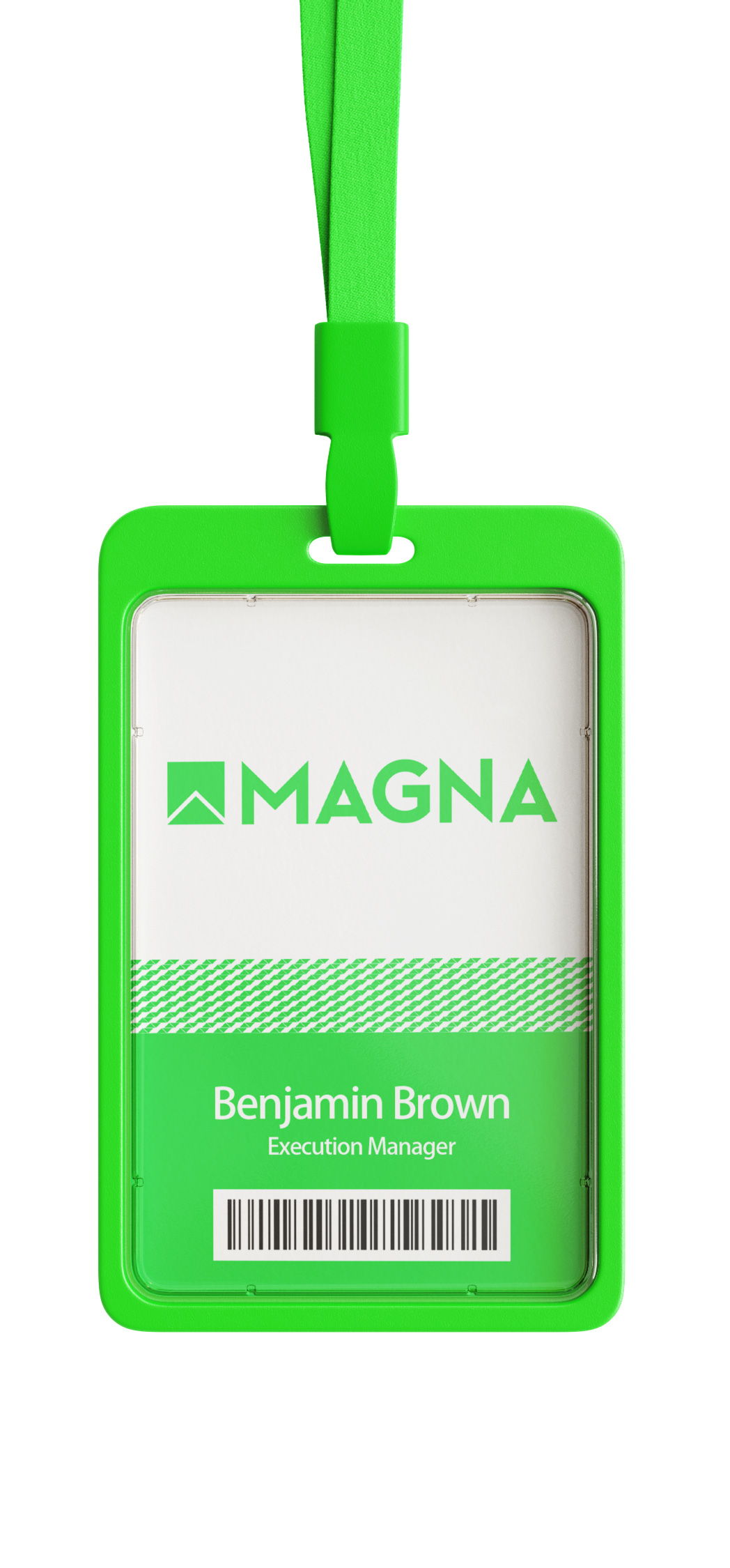
Vivid Malachite is the primary color in Magna KW's brand identity, and it represents growth, vitality, and renewal. This bright and bold shade of green is eye-catching and creates a sense of energy and freshness. It is versatile and can be paired with other colors to create a vibrant and cohesive visual identity. In addition to being a bold and visually appealing color, Vivid Malachite also represents MAGNA's commitment to sustainability and eco-friendliness, as green is often associated with environmentalism.

Pattern
The pattern created for Magna KW is inspired by fabric textures and is composed of small triangles arranged in a visually appealing manner. The triangles form an intricate yet cohesive design that resembles a textile weave. This pattern serves as a unique and recognizable visual element of Magna.
The triangle shape used in Magna's pattern design is the same as the one featured in the brand's signature. This creates a cohesive visual language that reinforces the brand's identity and message. The use of consistent shapes and elements across different touchpoints also helps to establish a recognizable and memorable brand presence in the minds of customers.

This is our recommended design for Magna KW's exhibition booth.
